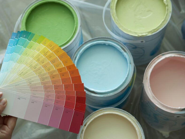
Did you ever paint a room that turned out differently than you imagined?
It’s probably because of undertones. Paint undertones are subtle colors that can make or break your space’s vibe.
In this article, I’ll explain paint undertones in colors and give simple tips to help you avoid typical problems and create a balanced environment. You will also learn to match your colors with your décor and lighting for a polished, unified design.
Be it refreshing paint in a small nook or building your dream house, paint undertones will give you a little edge in choosing the right color.
What Are Paint Undertones in Color, and Why Do They Matter?
Paint undertones are delicate, underlying colors that affect the look and feel of the finished wall.
The undertone provides depth and character, influencing the perception of color as warm or cold—the devil is in the details. Yellow, beige, or pink depict warm undertones, whereas blue or green reflect cool undertones.
For example, depending on its undertones and the setting, white might seem creamy or crisp, and gray can lean blue or green.
The pigments shape colors; that’s where those undertones come from. Warm, inviting beige becomes more appealing when it takes on the yellow undertones. On the other hand, gray undertones have a more extraordinary contemporary appeal.
Keep in mind that lighting and surroundings can also change the way your paint looks. So you should keep undertones in mind when choosing paint for your environment.
But why do paint undertones matter?
Paint undertones in colors influence the harmony of your design. A white wall with a cold undertone may clash with warm-toned cabinets. Likewise, grey with red undertones adds warmth, while blue undertones make a room feel tranquil.
The Science Behind Undertones: Making Color Work for Your Space
Understanding undertones transforms choosing paint from a simple task into a whole new ballgame. Knowing the nitty gritty about undertones is crucial to inform your color choices. It has a significant impact on the way the color feels and looks in your home.
What is the difference between undertone and mass tone?
The mass tone is the first color you perceive, but the undertone offers depth and may change the vibe. For example, two white paints may appear to be similar at first glance, yet one may be chilly with blue undertones while the other warm with yellow hints. To see undertones, place your sample near pure white in natural light. Doing so will reveal if it has warm yellows, cool blues, or neutral grays.
The Role of Paint Undertones in Color Temperature
Paint undertones exert a significant impact, irrespective of cool or warm colors.
Warm colors, such as red or yellow, provide vitality and comfort, whereas cool colors, such as blue or green, promote tranquility and openness. Blue-grey looks sleek and futuristic. It’s great for businesses. Pinkish beige, on the other hand, warms your living room.
Simplifying Paint Undertones
Using an undertone color wheel makes matching décor a piece of cake and saves you from clashing colors. Identifying warm and cool tones will help you match your paint, décor, and lighting. It’s a simple method to prevent clashing colors and create a harmonious setting you’ll like.
How do you identify paint color undertones like a pro?
Figuring out paint undertones in colors is a game-changer when designing a well-coordinated room. Here’s how to identify them with precision:
1. Compare with White
To really nail it down, compare your paint sample to a pure white base to uncover hidden undertones. When compared to genuine white, a beige color may seem pink or yellow.
2. Check the Paint Strip
Examine the deepest shade on the strip where your preferred color appears. This foundation hue often suggests the undertone shared by all the shades in the collection.
For example, a gray made from navy will have a cool blue undertone.
3. Side-by-Side Comparison
Compare your sample to a primary version of the color. A red that seems somewhat orange has warm undertones, whereas one that appears purple is colder.
4. Test in Real Lighting
Paint a sample straight onto your wall or board and study it at various times of the day—it might lead to a lightbulb moment about what works best in your space. Lighting changes can highlight undertones. For example, a grey with green tints becomes more visible under warm artificial light.
5. Consider Surroundings
Match your paint undertones in colors to permanent features such as floors or cabinets. Pinkish beige may conflict with warm oak hues, so compare them to existing characteristics.
6. Use a Paint Undertone Color Wheel
A paint undertone color wheel clarifies undertones and how they work with other tints, particularly for complex paint colors like taupe or greige.
Design Basics: Room Direction, Lighting, and Undertones
To turn your space into a peaceful retreat, focus on three things: room direction, lighting, and undertones. They work together to define the look of paint undertones. Your choices will add to the room’s uniqueness.
Considering Orientation of a Space
The direction your room faces has a significant impact on how light interacts with color.
- North-facing rooms: These rooms usually have indirect lighting that can make colors appear subdued. Warmer colors, such as creamy beige or buttery yellow, create a cozy, inviting atmosphere.
- South-facing rooms: With plenty of warm, golden light, colors like seafoam green or slate blue help to balance the brightness and keep the area from seeming too warm.
- East-facing rooms: Bright morning light brings colors to life, while softer afternoon shadows call for soothing tones such as dark lavender or sage paint colors.
- West-facing rooms: These provide dynamic lighting that changes from mild morning light to dazzling sunsets. This setting works well with earthy tones like terracotta paint colors or deep teal.
How Does Lighting Affect Paint Color?
Lighting is a color’s best friend—or worst enemy.
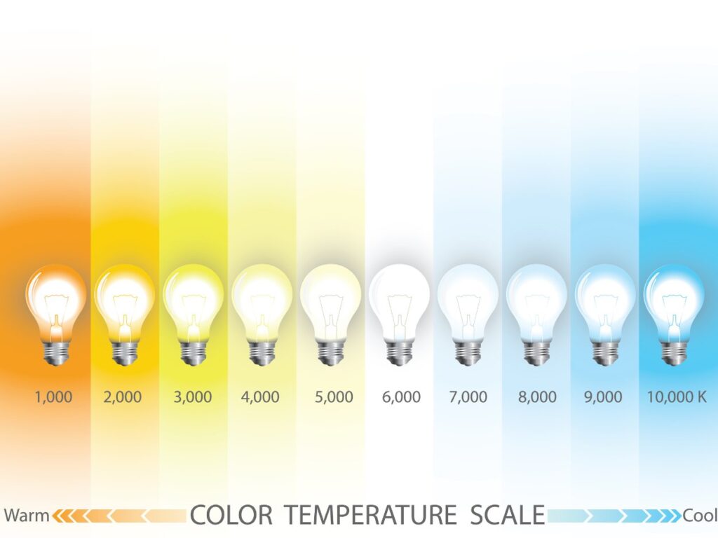
Natural light varies throughout the day, but artificial lighting has its impact. Warm white lights brighten reds and yellows, providing a cozy atmosphere, while cool LEDs emphasize blues and grays for brightness. Using varied light sources creates a balanced look, which is key in spaces with mixed lighting.
How to Match Paint Undertones in Colors?
Paint undertones have a subtle impact on a color’s depth and compatibility. Determining undertones, like contrasting a beige sample with pure white, ensures you get it right the first time and avoid unexpected results.
Matching paint undertones between areas helps you hit the nail on the head for a cohesive design. For example, a warm beige living room can blend into a delicate sage green corridor. Be cautious of immovable features such as flooring and cabinets, and ensure that undertones complement rather than conflict.
Tip: Testing a color before committing is a no-brainer to avoid costly surprises later. Paint a few samples on several walls or, better yet, a mobile board. Watch how it changes during the day and under various lighting conditions. What seemed dreamlike in the morning may become overwhelming by nightfall.
Common Paint Undertone Challenges and How to Fix Them
Mismatching paint undertones in colors leads to unexpected and annoying effects, such as walls that don’t match your lighting or furnishings. Let’s discuss some typical problems and how to solve them, one undertone at a time.
The “Why Does This Look Green?” Problem
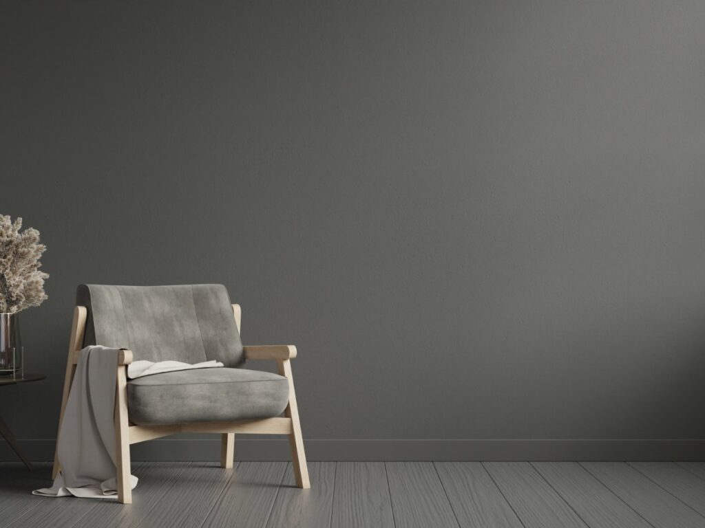
Have you ever painted a room gray, only to find that it appears green? It happens when the undertones in the paint pick up on warm lighting or furnishings nearby.
Fix: You can apply paint samples on your walls and observe how their appearance changes throughout the day. If the greenish tint is still too strong, consider switching to a gray with blue or neutral undertones. You can also balance the effect with cool-toned décor—think navy throw pillows or silver accents.
Beige That’s Just Off
Beige can be tricky, thanks to its subtle undertones of pink, yellow, or even orange. Yellow-heavy beige might feel excessively bright and sunny, while a pinky beige can resemble peach.
Fix: Hold a sample of your beige paint next to a sheet of white paper to make its undertones more obvious. Once you have identified the undertone, use complementary colors to balance it. For example, pair yellow beige with cool greys or greens, and tone down pinky beige with soft blues or crisp whites.
White That Feels Too Blue or Too Yellow
White paint isn’t as simple as it seems. A white with blue undertones can feel cold and clinical, while yellowish whites might appear too creamy or dated.
Fix: If your white space seems too harsh, use natural elements, such as tan rugs or wooden furniture, to provide warmth. If it’s too yellow, add cool components such as blue accents, neutral grays, or LED lights that mimic daylight.
Bold Colors That Overpower
Deep, dramatic shades like navy, black, or emerald green can dominate a space. It is especially true if their undertones lean toward green, purple, or brown.
Fix: Before committing, you can test the paint next to key elements, like your flooring and natural light. Choose a matte finish to lighten the color if it seems too strong. Use neutral furniture to counterbalance vivid hues, or use woven baskets, area rugs, or cozy blankets to provide texture.
Inconsistent Undertones Between Rooms
Moving from one area to another in a room with conflicting paint undertones might make it feel abrupt and disconnected.
Fix: Before you begin painting, spread out all the colors you have selected. Keep the undertones consistent across the spaces for a more harmonious flow. If you have doubts about bringing everything together harmoniously, choose a neutral “bridge” color, such as a greige paint color.
Pro Tip: Paint is only temporary, so don’t worry too much! To determine what paint undertones best suit your area, try different lighting options, furnishings, or even a fresh coat of paint.
Unique Paint Undertone Examples to Get You Going
1. Greige – The Perfect Neutral
What color should I paint my living room?
If you have ever asked that question, then grey paint is the answer. Greige, a mix of grey and beige, blends warmth and elegance.
Picture a living room with a spiced honey feature wall—warm greige with golden undertones—paired with cooler walnut on adjacent walls. Add wooden furniture or terracotta accents for a serene, modern vibe. Greige suits both warm and cool schemes, making it a versatile choice.
2. Swiss Coffee – Warm Whites
Benjamin Moore paint colors are a great option. Swiss Coffee paint color provides a smooth, classic background with hints of green, yellow, and gray. It retains warmth while enhancing natural light, making it ideal for kitchens with brass fittings and quartz worktops. It looks good with vivid accents or hardwood flooring and is perfect for smaller areas.
3. Taupe – Earthy and Sophisticated
Taupe paint color, with its gray and brown undertones, adapts to lighting for an earthy neutrality. Use shades like Perfect Taupe in dining areas, paired with sapphire curtains or emerald upholstery for an inviting yet dramatic look. Taupe excels at blending traditional and contemporary styles.
4. Blue-Grey – Cool Elegance
What color do you paint the bedroom?
Blue-grey hues are an excellent option for bedroom paint color ideas. Hues like Misty Skies create a calm environment. They provide a sophisticated calmness and complement white trimmings, plush bedding, and metallic accessories, which make them ideal for bedrooms.
5. Warm Yellows – Cheerful Yet Subtle
Buttered almonds and other warm yellows brighten small areas without becoming overpowering. For an airy, welcoming atmosphere, you can combine these with white accents and oak flooring.
Master the Art of Undertones in Your Space
Making confident choices that complement your lighting, décor, and design concept requires an understanding of paint undertones in colors. Knowing undertones will ensure your walls improve your room’s look. It does not matter if you use taupe for sophistication or greige for a calm feel.
Are you ready to refresh your home design?
Please email me at russel@astrokeofcolor.net for personalized advice or expert help with your painting project. I’m happy to help!
A Simple Process for Choosing Paint Undertones in Colors
Ø Find Undertones: Examine paint samples in both natural and artificial lighting, comparing them to white.
Ø Match with Décor: Make sure the paint color matches the undertones well with the furniture or flooring that is already there.
Ø Lighting Test: Apply paint samples to the walls and note variations throughout the day. Once everything checks out, you’ll be good to go with your final choice.
Ø Achieve Balance: For a cohesive appearance, combine warm and cool tones with neutral components.
FAQ
1. What is Paint Undertone, and Why is it Important?
An undertone is a subtle color beneath the paint’s main shade, revealed in different lighting or alongside other colors. It ensures your walls complement your décor and maintain harmony.
2. How Do I Figure Out the Paint’s Undertone?
Test paint undertones in colors with swatches on walls or sample boards, observing them in natural and artificial light. Compare with pure white or neutral shades to uncover hidden undertones.
3. Do Paint Color Undertones Clash?
Yes. For example, pinkish beige can conflict with cool blue-grey. Matching paint undertones in colors ensures cohesion.
4. Does Lighting Affect Undertones?
Definitely! Lighting can shift paint undertones—test paint in your room’s light to avoid surprises.
5. Can I Mix Warm and Cool Undertones?
Yes, with finesse. Use neutral elements to balance warm and cool tones for a cohesive look.