Month: January 2025

What are Paint Undertones in Colors, and How Do They Affect Your Space?

Did you ever paint a room that turned out differently than you imagined?

It’s probably because of undertones. Paint undertones are subtle colors that can make or break your space’s vibe.

In this article, I’ll explain paint undertones in colors and give simple tips to help you avoid typical problems and create a balanced environment. You will also learn to match your colors with your décor and lighting for a polished, unified design.

Be it refreshing paint in a small nook or building your dream house, paint undertones will give you a little edge in choosing the right color.

What Are Paint Undertones in Color, and Why Do They Matter?

Paint undertones are delicate, underlying colors that affect the look and feel of the finished wall.

The undertone provides depth and character, influencing the perception of color as warm or cold—the devil is in the details. Yellow, beige, or pink depict warm undertones, whereas blue or green reflect cool undertones.

For example, depending on its undertones and the setting, white might seem creamy or crisp, and gray can lean blue or green.

The pigments shape colors; that’s where those undertones come from. Warm, inviting beige becomes more appealing when it takes on the yellow undertones. On the other hand, gray undertones have a more extraordinary contemporary appeal. 

Keep in mind that lighting and surroundings can also change the way your paint looks. So you should keep undertones in mind when choosing paint for your environment.

But why do paint undertones matter?

Paint undertones in colors influence the harmony of your design. A white wall with a cold undertone may clash with warm-toned cabinets. Likewise, grey with red undertones adds warmth, while blue undertones make a room feel tranquil.

The Science Behind Undertones: Making Color Work for Your Space

Understanding undertones transforms choosing paint from a simple task into a whole new ballgame. Knowing the nitty gritty about undertones is crucial to inform your color choices. It has a significant impact on the way the color feels and looks in your home.

What is the difference between undertone and mass tone?

The mass tone is the first color you perceive, but the undertone offers depth and may change the vibe. For example, two white paints may appear to be similar at first glance, yet one may be chilly with blue undertones while  the other warm with yellow hints. To see undertones, place your sample near pure white in natural light. Doing so will reveal if it has warm yellows, cool blues, or neutral grays.

The Role of Paint Undertones in Color Temperature

Paint undertones exert a significant impact, irrespective of cool or warm colors.

Warm colors, such as red or yellow, provide vitality and comfort, whereas cool colors, such as blue or green, promote tranquility and openness. Blue-grey looks sleek and futuristic. It’s great for businesses. Pinkish beige, on the other hand, warms your living room.

Simplifying Paint Undertones

Using an undertone color wheel makes matching décor a piece of cake and saves you from clashing colors. Identifying warm and cool tones will help you match your paint, décor, and lighting. It’s a simple method to prevent clashing colors and create a harmonious setting you’ll like.
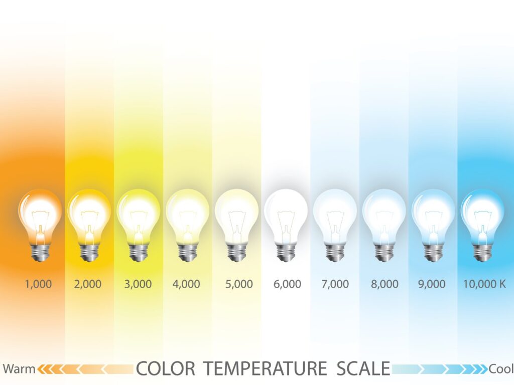
the color temperature scale

How do you identify paint color undertones like a pro?

Figuring out paint undertones in colors is a game-changer when designing a well-coordinated room. Here’s how to identify them with precision:

1.   Compare with White

To really nail it down, compare your paint sample to a pure white base to uncover hidden undertones. When compared to genuine white, a beige color may seem pink or yellow.

2.   Check the Paint Strip

Examine the deepest shade on the strip where your preferred color appears. This foundation hue often suggests the undertone shared by all the shades in the collection.

For example, a gray made from navy will have a cool blue undertone.

3.   Side-by-Side Comparison

Compare your sample to a primary version of the color. A red that seems somewhat orange has warm undertones, whereas one that appears purple is colder.

4.   Test in Real Lighting

Paint a sample straight onto your wall or board and study it at various times of the day—it might lead to a lightbulb moment about what works best in your space. Lighting changes can highlight undertones. For example, a grey with green tints becomes more visible under warm artificial light.

5.   Consider Surroundings

Match your paint undertones in colors to permanent features such as floors or cabinets. Pinkish beige may conflict with warm oak hues, so compare them to existing characteristics.

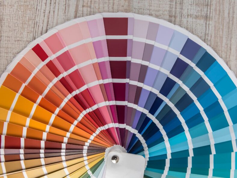
6.   Use a Paint Undertone Color Wheel

A paint undertone color wheel clarifies undertones and how they work with other tints, particularly for complex paint colors like taupe or greige.

Design Basics: Room Direction, Lighting, and Undertones

To turn your space into a peaceful retreat, focus on three things: room direction, lighting, and undertones. They work together to define the look of paint undertones. Your choices will add to the room’s uniqueness.

Considering Orientation of a Space

The direction your room faces has a significant impact on how light interacts with color.

  • North-facing rooms: These rooms usually have indirect lighting that can make colors appear subdued. Warmer colors, such as creamy beige or buttery yellow, create a cozy, inviting atmosphere.
  • South-facing rooms: With plenty of warm, golden light, colors like seafoam green or slate blue help to balance the brightness and keep the area from seeming too warm.
  • East-facing rooms: Bright morning light brings colors to life, while softer afternoon shadows call for soothing tones such as dark lavender or sage paint colors.
  • West-facing rooms: These provide dynamic lighting that changes from mild morning light to dazzling sunsets. This setting works well with earthy tones like terracotta paint colors or deep teal.

How Does Lighting Affect Paint Color?

Lighting is a color’s best friend—or worst enemy.

Natural light varies throughout the day, but artificial lighting has its impact. Warm white lights brighten reds and yellows, providing a cozy atmosphere, while cool LEDs emphasize blues and grays for brightness. Using varied light sources creates a balanced look, which is key in spaces with mixed lighting.

How to Match Paint Undertones in Colors?

Paint undertones have a subtle impact on a color’s depth and compatibility. Determining undertones, like contrasting a beige sample with pure white, ensures you get it right the first time and avoid unexpected results.

Matching paint undertones between areas helps you hit the nail on the head for a cohesive design. For example, a warm beige living room can blend into a delicate sage green corridor. Be cautious of immovable features such as flooring and cabinets, and ensure that undertones complement rather than conflict.

Tip: Testing a color before committing is a no-brainer to avoid costly surprises later. Paint a few samples on several walls or, better yet, a mobile board. Watch how it changes during the day and under various lighting conditions. What seemed dreamlike in the morning may become overwhelming by nightfall.

Common Paint Undertone Challenges and How to Fix Them

Mismatching paint undertones in colors leads to unexpected and annoying effects, such as walls that don’t match your lighting or furnishings. Let’s discuss some typical problems and how to solve them, one undertone at a time.

The “Why Does This Look Green?” Problem

Have you ever painted a room gray, only to find that it appears green? It happens when the undertones in the paint pick up on warm lighting or furnishings nearby.

Fix: You can apply paint samples on your walls and observe how their appearance changes throughout the day. If the greenish tint is still too strong, consider switching to a gray with blue or neutral undertones. You can also balance the effect with cool-toned décor—think navy throw pillows or silver accents.
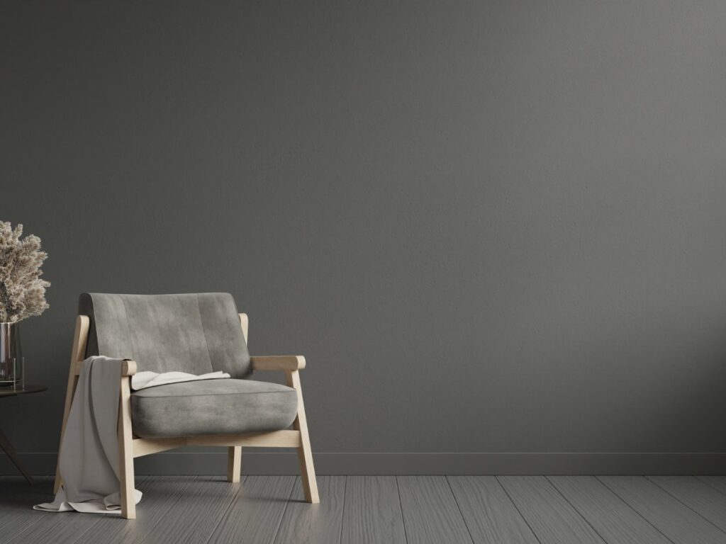
gray room that looks green

Beige That’s Just Off

Beige can be tricky, thanks to its subtle undertones of pink, yellow, or even orange. Yellow-heavy beige might feel excessively bright and sunny, while a pinky beige can resemble peach.

Fix: Hold a sample of your beige paint next to a sheet of white paper to make its undertones more obvious. Once you have identified the undertone, use complementary colors to balance it. For example, pair yellow beige with cool greys or greens, and tone down pinky beige with soft blues or crisp whites.

White That Feels Too Blue or Too Yellow

White paint isn’t as simple as it seems. A white with blue undertones can feel cold and clinical, while yellowish whites might appear too creamy or dated.

Fix: If your white space seems too harsh, use natural elements, such as tan rugs or wooden furniture, to provide warmth. If it’s too yellow, add cool components such as blue accents, neutral grays, or LED lights that mimic daylight.

Bold Colors That Overpower

Deep, dramatic shades like navy, black, or emerald green can dominate a space. It is especially true if their undertones lean toward green, purple, or brown.

Fix: Before committing, you can test the paint next to key elements, like your flooring and natural light. Choose a matte finish to lighten the color if it seems too strong. Use neutral furniture to counterbalance vivid hues, or use woven baskets, area rugs, or cozy blankets to provide texture.

Inconsistent Undertones Between Rooms

Moving from one area to another in a room with conflicting paint undertones might make it feel abrupt and disconnected.

Fix: Before you begin painting, spread out all the colors you have selected. Keep the undertones consistent across the spaces for a more harmonious flow. If you have doubts about bringing everything together harmoniously, choose a neutral “bridge” color, such as a greige paint color.

Pro Tip: Paint is only temporary, so don’t worry too much! To determine what paint undertones best suit your area, try different lighting options, furnishings, or even a fresh coat of paint.

Unique Paint Undertone Examples to Get You Going

1.   Greige – The Perfect Neutral

What color should I paint my living room?

If you have ever asked that question, then grey paint is the answer. Greige, a mix of grey and beige, blends warmth and elegance.

Picture a living room with a spiced honey feature wall—warm greige with golden undertones—paired with cooler walnut on adjacent walls. Add wooden furniture or terracotta accents for a serene, modern vibe. Greige suits both warm and cool schemes, making it a versatile choice.

2.   Swiss Coffee – Warm Whites

Benjamin Moore paint colors are a great option. Swiss Coffee paint color provides a smooth, classic background with hints of green, yellow, and gray. It retains warmth while enhancing natural light, making it ideal for kitchens with brass fittings and quartz worktops. It looks good with vivid accents or hardwood flooring and is perfect for smaller areas.

3.   Taupe – Earthy and Sophisticated

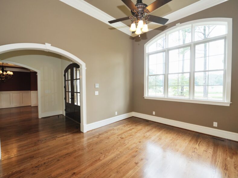
Taupe paint color, with its gray and brown undertones, adapts to lighting for an earthy neutrality. Use shades like Perfect Taupe in dining areas, paired with sapphire curtains or emerald upholstery for an inviting yet dramatic look. Taupe excels at blending traditional and contemporary styles.

4.   Blue-Grey – Cool Elegance

What color do you paint the bedroom?

Blue-grey hues are an excellent option for bedroom paint color ideas. Hues like Misty Skies create a calm environment. They provide a sophisticated calmness and complement white trimmings, plush bedding, and metallic accessories, which make them ideal for bedrooms.

5.   Warm Yellows – Cheerful Yet Subtle

Buttered almonds and other warm yellows brighten small areas without becoming overpowering. For an airy, welcoming atmosphere, you can combine these with white accents and oak flooring.

Master the Art of Undertones in Your Space

Making confident choices that complement your lighting, décor, and design concept requires an understanding of paint undertones in colors. Knowing undertones will ensure your walls improve your room’s look. It does not matter if you use taupe for sophistication or greige for a calm feel.

Are you ready to refresh your home design?

Please email me at russel@astrokeofcolor.net for personalized advice or expert help with your painting project. I’m happy to help!

A Simple Process for Choosing Paint Undertones in Colors

Ø  Find Undertones: Examine paint samples in both natural and artificial lighting, comparing them to white.

Ø  Match with Décor: Make sure the paint color matches the undertones well with the furniture or flooring that is already there.

Ø  Lighting Test: Apply paint samples to the walls and note variations throughout the day. Once everything checks out, you’ll be good to go with your final choice.

Ø  Achieve Balance: For a cohesive appearance, combine warm and cool tones with neutral components.

FAQ

1.   What is Paint Undertone, and Why is it Important?

An undertone is a subtle color beneath the paint’s main shade, revealed in different lighting or alongside other colors. It ensures your walls complement your décor and maintain harmony.

2.   How Do I Figure Out the Paint’s Undertone?

Test paint undertones in colors with swatches on walls or sample boards, observing them in natural and artificial light. Compare with pure white or neutral shades to uncover hidden undertones.

3.   Do Paint Color Undertones Clash?

Yes. For example, pinkish beige can conflict with cool blue-grey. Matching paint undertones in colors ensures cohesion.

4.   Does Lighting Affect Undertones?

Definitely! Lighting can shift paint undertones—test paint in your room’s light to avoid surprises.

5.   Can I Mix Warm and Cool Undertones?

Yes, with finesse. Use neutral elements to balance warm and cool tones for a cohesive look.
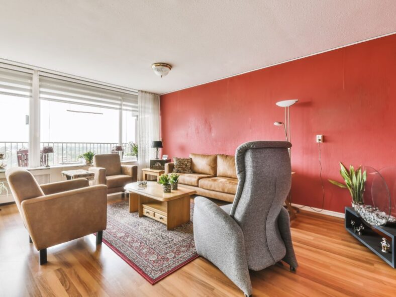
Accent Walls: How To Add A Personal Touch To Your Space

Accent walls are one of the best ways to transform your space with authentic charm and a personal touch that will impress your guests. Choosing the right wall for your accent wall will determine how everybody will perceive it. From picking the right color to balancing it with the surrounding decor and furniture, there are lots of decisions that go into this process.

Another thing that will define your statement wall is its texture—the material you use—which adds tactility as a new dimension to the space. Your taste and creative decisions will determine all this. Keep in mind that an accent wall needs to be cleaned or refreshed now and then and that some rooms will not be the best spot to put this decorative feature.

If you ever wondered how you can add a unique and authentic personal charm to a room, then accent walls are the way to go. 

All of the furniture you add to the room can be replicated in other homes, depending on the popularity of the furniture style and brand. However, the authenticity of your personality cannot be copied. That’s where accent walls come in—to spice up the room to your own liking. 

How can you achieve this in your home in a way that won’t visually clutter the room? Or, a better question is, how to balance an accent wall with a room?

Achieving this might seem like a complex job, but I’ll show you all of the creative accent wall tips for modern homes that you can use. 

So, without further ado, let’s get into it together, shall we?

Defining Accent Wall

First things first: Let’s discuss what accent walls actually are. 

There are many ways you can define it. In its most basic form, an accent wall is a singular wall in the room, painted in a different, usually contrasting color. 

When you watch paintings, there will always be a main figure, shape, or a point in composition where the eyes will be drawn. In interior design, accent walls do the same thing on a much grander scale.

An accent wall creates a focal point with decorative features where guests will see get the feel of what your home represents and what kind of atmosphere it radiates.

In a way, they are your personal shrine, representing your taste and authentic persona in the most extraordinary way interior design can show. This “trick” can be used in any room of the house, regardless of the purpose and size of the room.

Choosing the Right Wall for an Accent

How do you choose the right accent wall for a particular room in your home? 

The most popular room for an accent wall is the living room. Statement walls in living rooms are the ones that will be seen the most throughout the day because that’s where family and friends spend time together.

The best wall for living rooms has noticeable architectural or artistic features. 

  • When it comes to architectural features, these can range from fireplaces, walls with interesting ornaments, or just the longest wall in space that naturally differs from the other walls in the room.
  • Artistic features could be an interesting painting, ornament, or sculpture in front of the wall. This is nicely complemented with a differently-colored wall.

In addition to the living room, the bedrooms is another great place for an accent walls. 

So, how to use accent walls in bedrooms? The best wall for this room is the one with your bed in front of it. 

Bedrooms need to have a relaxing atmosphere that will help you get that beauty sleep that we all need. We don’t want the walls in front and beside the bed to have a contrast that will disrupt our rest. However, this doesn’t mean that we can’t have a creative touch here, too.

This is why the best wall for creative statements is the one that is behind the bed, so it doesn’t interfere with our view while we rest. When you add in complementing furniture like bedside tables, your bedroom can be beautiful without disturbing your sleep.

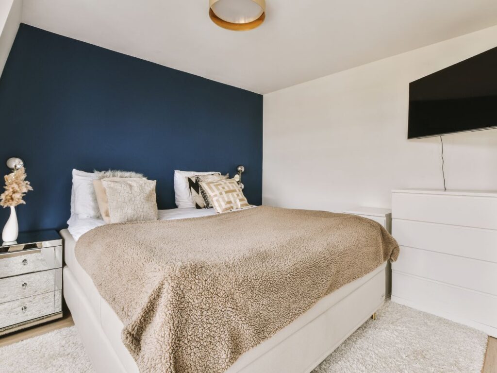
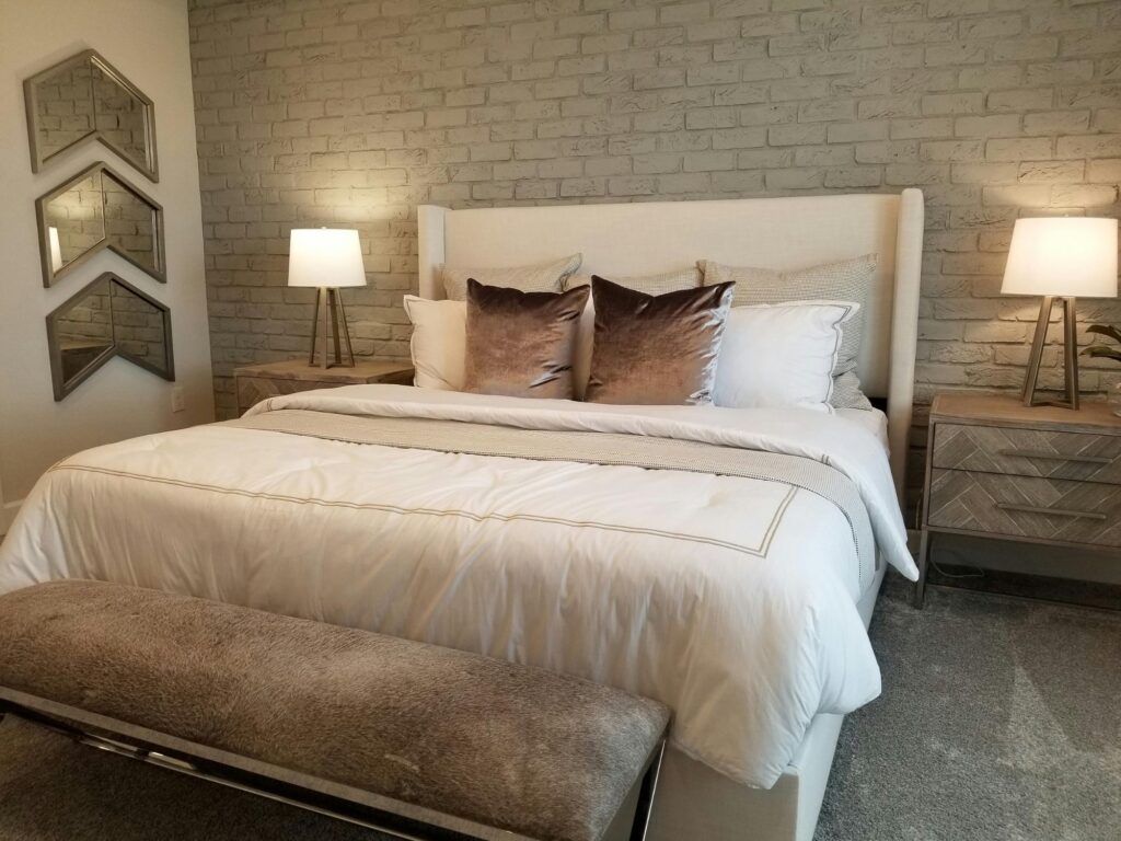
accent wall bedroom

Picking The Right Color For Your Accent Wall

The best colors for accent walls are the ones that will complement the atmosphere or the “groove” of the room. This is where the color palette comes in as the most important factor that will determine what color will be used.

As a general rule, the color of the furniture and other walls should also influence the color chosen to contrast with them. You should always have the entire room in mind when picking the right color.

If you have lighter furniture, such as a minimalistic interior, then deeper, rich hues, such as SW6300 by Sherwin Williams or Bohr’s color of the year, Rumors, will fit nicely and will stand out in a way that will not be an eyesore in the space. 

Opposite of that, in the case of darker furniture, lighter walls, such as Benjamin Moore’s Sun Kissed Yellow, can freshen up the atmosphere and bring out furniture colors.

In my work, I have always used color theory to experiment and find the palette that will be a perfect balance for the furniture’s composition and clients’ accent wall design ideas. This is a delicate job. You don’t want overly strong colors to scream over everything and suffocate the space.

This balance is especially important in accent walls for small rooms where the wrong color can make the room appear even smaller and cluttered beyond tolerability.

Texture And Finishes On Accent Wall

There is more to accent wall color ideas than picking the right colors. Other aspects, such as texture, patterns, and finish are also one of the ways how you can enrich your decorative features. 

Using different finishes can change the overall aesthetics. Matte, satin, or glossy textures can add tactility to your accent wall and bring a new dimension to your authentic touch to your space. This can introduce contrast in the color palette and in texture contrast, too. 

Using different materials can be an original way to spice up the atmosphere. This can be achieved with chalkboard paint, wood paneling, metallic finishes, or even by adding an actual mirror! 

That will create an illusion of much bigger space in smaller rooms and have an effect that will amaze everyone who enters the room. 

Another bolder choice for the more adventurous among us is using wallpaper with patterns.

The possibilities are endless when introducing other materials, but of course, always be wary when you do too much remodeling and when you need to tone it down a notch. 

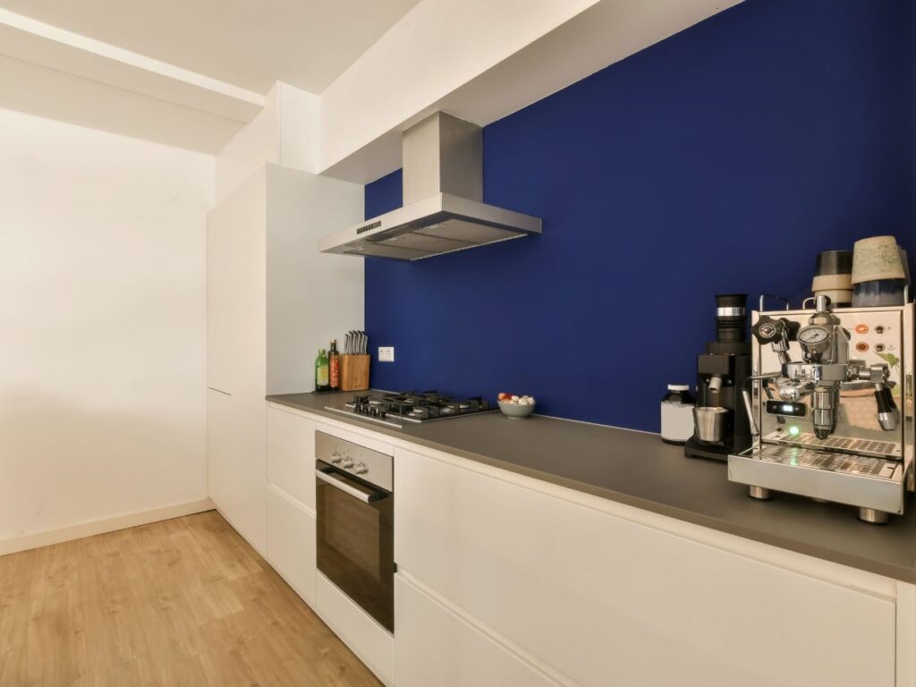
accent wall kitchen

Possible Downsides of Accent Walls

Now that we have done all of the creative ideas and suggestions, we have to discuss some realistic responsibilities and downsides. 

When choosing materials, take into consideration that some of them will need proper maintenance, so make sure you do the homework to learn proper cleaning methods for the finish and color you have chosen.

Keep in mind that some rooms with limited natural light will not be the right choice for decorating them with accent walls. 

This also goes for smaller rooms. There is a very thin line between interesting decoration and a suffocated room that will not have the desired effect.

There are always other ways you can enrich your living space. So why not try colorful furniture, art, or statement lighting that can also have a powerful effect on the aesthetics and atmosphere in the room?

Oh, and be sure to prep your walls properly before painting your accent wall!

Conclusion

So, in the end, when we think about the question, “Are accent walls still in style?” the answer is yes!

There are always ways you can approach enriching your space, and accent walls are one of the best tricks where you can show off your creativity.
Interested in learning more? Email me at russel@astrokeofcolor.net for help with your accent wall project. Happy decorating!

6 Fresh Color Trends to Transform Your Home in 2025

If you want to give your home a facelift but don’t know where to start, then you may want to turn to the latest paint color trends in 2025. You know that I’m a fan of choosing practical paint colors that will survive the test of time. But some people like to change out paint colors like they change out their wardrobe from year to year. If you’re one of those people,  then this post is for you.

This year, we’re going to see people turn away from trends like “Millennial Gray” and sterile whites. This year, we’ll see more earth tones that make a space feel grounded and welcoming. In fact, I think “grounded” is the word of the year when it comes to paint color trends in 2025.

In this post, I’ll walk you through five color trends that are making a “splash” in 2025. 

1. Earthy Browns with a Hint of Purple

If you’re looking to bring a sense comfort into your space, 2025’s earthy tones are the way to go. We’re talking deep browns, muted greens, and rich terracotta—colors that make you feel connected to nature. 

A great example of this is Truffle by Stainmaster, a paint brand at Lowe’s. It’s a rich, earthy chocolate brown with just a hint of taupe. It’s perfect for an accent wall or even for all four walls in a living room. It’s similar to Benjamin Moore’s 2025 color of the year, Cinnamon Slate. It’s a deep plum-brown combo. It gives off a relaxed, yet sophisticated feeling. It would be ideal for a bedroom or dining area. A third heavy-hitter of the brown/pink variety is Little Greene’s Mochi. It’s a light peachy-brown that adds a soft warmth to any room.

These colors will make your space feel grounded and calm. They’re versatile enough to work in almost any room, whether you’re going for a rustic, minimalist, earthy, or modern aesthetic. 

2. Deep Jewel Tones with a Twist

If you’re looking to make a bold change but want to keep things feeling grounded—I guess “grounded” is our word for 2025—then you’ll want to check out deep jewel tones. These colors are rich and powerful, but they’ve got a softer side, too. They’re not the loud, bright jewel tones you might be thinking of, like sapphire and ruby. They’ve got more depth and complexity to them.

Purple Basil by Glidden is a deep, warm violet. It’ll make your room feel cozy yet striking. It’s bold enough to stand out but still feels inviting. Then there’s Violet from Minwax, which is a rich, earthy shade of purple. It’s got a little more depth to it, so it doesn’t overwhelm the space but still gives you that pop of color. Encore, Valspar’s color of the year for 2025, is another great example—it’s a deep blue with a bit of gray in it, giving it a timeless feel that works in just about any room. Especially a bedroom, where blue may make you sleep better, according to some research.

These jewel tones are perfect for making a statement without feeling too stuffy or formal.

3. Muted and Muddied Pastels

The bright pastels of the past are taking a backseat in 2025. Instead, we’re seeing more toned-down shades that still give you a bit of color but in a way that feels soft and welcoming. These colors are great for creating calm spaces without a lot of noise.

Mapped Blue by Dutch Boy Paints is a great example of this. It’s a medium blue with gray undertones. It has a softer and more grounded feel than your typical pastel blue. It’s a versatile color that works well with a variety of styles. Mapped Blue has just the right balance of color to create a calming backdrop while still bringing some personality to the space. It’s perfect for living rooms, bedrooms, or even as an accent in a hallway.

If you’re looking for a pastel that doesn’t scream for attention but still makes an impact, Mapped Blue is the perfect shade for the job.

4. Rich, Earthy Tones for Depth and Drama

2025 is all about colors with depth—deep reds, rich browns, and earthy tones that ground a space and add a sense of drama. These make a statement but still feel cozy (are we noticing a theme here?)

Behr’s 2025 color of the year, Rumors, is a great example of this. It’s a muted red with brown undertones. It’s a deeper, more sophisticated version of red that adds warmth without completely taking over or being too warm. Raku by C2 Paint is another deep color with earthy undertones. It’s a burnt red-brown that adds elegance and intensity, perfect for formal spaces like a dining room or study.

5. Soft, Warm Neutrals

If you’re ready to ditch the cool, sterile grays from the past few years, 2025 is bringing in soft, warm neutrals that feel both comforting and versatile. These colors don’t steal the show, but they create the perfect backdrop for any room in your home.

A great example of this trend is Bosc Pear by Sherwin-Williams. It’s a rich, earthy yellow with a touch of green. It looks exactly like a Bosc pear, actually! I’d love to see this color in kitchens, bathrooms, or even as an accent in a living room. For a softer neutral, White Snow by Sherwin-Williams is a creamy off-white with just a hint of warmth. It’s perfect if you want to keep things light and airy but not sterile.

These soft neutrals are great for any room where you want a relaxed, open feel. Pair them with wooden furniture, stone accents, or vibrant textiles, and you’ll have a warm and welcoming space.

6. Nature-Inspired Greens

Greens are back in 2025, but we’re moving away from flashy greens in favor of more grounded hues. These colors connect your space to the outdoors and create a calm retreat in your home.

Rookwood Shutter Green by Sherwin-Williams is an excellent example of this trend. It’s a deep, earthy green that feels rooted in nature, making it perfect for living rooms, bedrooms, or even kitchens where you want to bring in some tranquility. Another great option is Medici Malachite by Benjamin Moore. It’s a jade green with blue undertones, and it pairs beautifully with natural wood finishes and stone accents.

Final Thoughts

The paint color trends of 2025 are all about creating a space that feels grounded, inviting, and full of personality. Embrace earthy browns, deep jewel tones, or calming muted pastels. These trends make your home feel cozy and timeless. 

I hope you take these trends as inspiration and experiment with shades that make you feel relaxed. A fresh coat of paint can do wonders for transforming a room. With the right color, you can create the perfect atmosphere for whatever you need. Happy painting!

Lighting in Interior Design

You might not realize it, but lighting can make or break a room. 

I didn’t always know that, either. Back when I was running my painting business, early in my career, I’d finish up a job…fresh paint on the walls, furniture arranged, everything looking good…but something would feel off. 

I remember one job where I was painting a family’s living room. I did the walls in a rich, warm color. Everything was set up perfectly, but the room still didn’t feel right. It was missing something.

The homeowner, Lisa, said to me, “I love the color, but it still feels kind of flat. Do you think we should change the lighting?” I was skeptical. But we added a few recessed lights in the ceiling, a couple of floor lamps, and some accent lights around the artwork. 

That turned out to be a real “light bulb moment” for us (forgive the pun). The room totally changed. That’s when I really understood that lighting is just as important as paint color psychology for creating the mood of the room.

After over a decade in the painting business, I’m sure lighting placement is one of the most important parts of interior design. So if you want to change up a room or make your space feel more inviting, pay attention to where you put those lights. 

In this blog, I’ll walk you through why lighting matters and how to use it to make your space feel as good as it looks.

The Role of Lighting in Interior Design

When you think about decorating a room, lighting isn’t usually the first thing you consider. But trust me, you should. You can pick out the best furniture, paint the walls the perfect color, and have all the right accessories, but if the lighting’s off, forget it.

The right lighting helps you see your space “in the best light.” If you want to create a relaxing living room, a bright and energetic kitchen, or a workspace that helps you concentrate, lighting is a big part of that. It can make a small room feel bigger or a big room feel cozier. It can make colors and textures pop.

There are three main types of lighting you should know about: ambient, task, and accent.

Ambient lighting is the general light that fills the room. Think ceiling lights, chandeliers, or natural light coming in through windows. It’s the base of the lighting in a room.

Task lighting is exactly what it sounds like: lights meant for specific tasks. This could be a reading lamp next to your favorite chair, under-cabinet lighting in the kitchen for cooking, or a desk lamp for your work area. 

Accent lighting draws attention to specific areas. You’ll see this in things like spotlights on artwork, lamps that highlight a sculpture, or lighting that shines up a feature wall. 

When you’ve got all three types working together in a room, you’ve got a lighting trifecta. 

How Lighting Placement Affects Mood and Ambiance

Where you place your lights really sets the mood. Harsh and bright lights can make a room feel cold. Soft, warm lights, on the other hand, can make it feel like home. 

Here are a few practical tips to get the lighting right:

Mix light sources at different heights 

If you’ve got a single overhead light, the room can feel flat and lifeless. Try using a mix of table lamps, floor lamps, or wall sconces to add layers to the light. This gives the room a more balanced and interesting feel. Any home you see in an interior design magazine definitely does this.

Use Dimmers 

With a dimmer switch, you can adjust the light level depending on the time of day or mood you want to create. You can have bright light for tasks or dim it down for a cozy evening.

Highlight Focal Points 

If you’ve got a feature wall, artwork, or any other design elements you want to show off, place lights that shine on them. You can use recessed lights or wall-mounted fixtures to bring attention to specific parts of the room.

Avoid Direct or Harsh Lighting 

For most rooms, try to avoid lights that shine directly into your eyes or give off too much glare. Instead, go with indirect lighting that reflects off walls or ceilings. This keeps things comfortable and gives you soft, even light.

Warm Up the Space 

If you want a cozy, inviting atmosphere, go for warm-toned light bulbs (around 2700K). Cold, bright lights tend to make rooms feel sterile (like a hospital) while warm lighting adds a comfortable, homey touch (like sepia-tone memories from childhood). 

Lighting also changes how the colors and textures in a room look. For example, light hitting a dark-colored wall can make it look even richer. But the wrong light can make it seem dull. If you love the color of a wall during the daytime but can’t stand it in the evening, you may need to switch up the lighting “temperature.” 

If you’ve got textured walls or unique features in the room, shine some light on them to show them off. You can do this directly like a spotlight, but sometimes it’s better to let it bounce off a wall or the ceiling to get a more even effect.

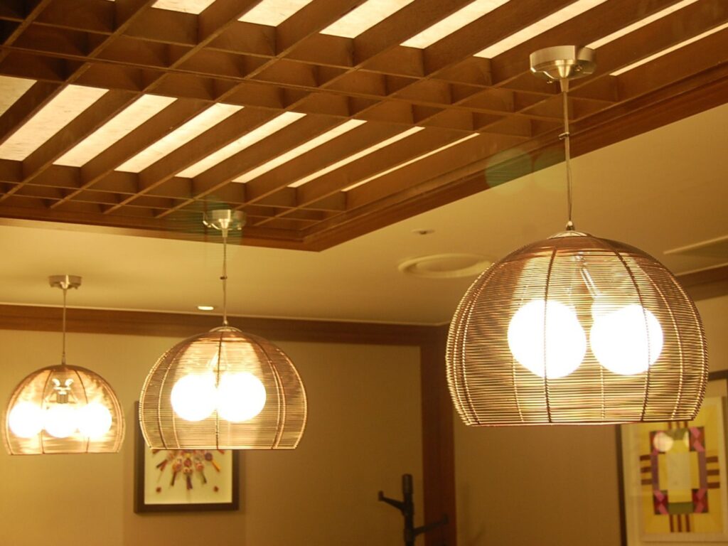
pendant lights

Layering Light

Like I said before, layering light is probably the biggest “pro move” you can do when it comes to your lighting. This means you’ll include light at different levels or locations in the room for an interesting effect.

Let’s break down how you can use layers of light to really bring a room to life:

Balance light levels

A room needs light coming from a few different places. If you rely on just one light source, it’s like a light bulb hanging from a string in a closet. Everything looks flat, no matter how beautiful your paint colors are.

Use a combination of overhead lights, lamps, and even low-level lighting on the floor. This adds dimension and helps to avoid harsh shadows or super bright spots. It gives the space more life.

Create zones

In bigger rooms, you can use lighting to create different “zones” for different activities. Follow this rule: bright lights for work, dimmer lights for relaxation.

If you work at a desk, you can put focused task lighting by it. If you love to read on the couch, you can add a lamp that helps without overwhelming the space. I personally can’t stand reading with an overhead light. I use my lamps every day! 

For areas where people gather and hang out, use softer lighting to keep the room feeling warm and relaxed.

Use lighting to enhance shapes and texture

If you have any neat art or architectural features you want to highlight, that’s where accent lights come in. You can even use accent lights to highlight exposed brick or a nice rug. 

Light can help emphasize curves, edges, or any unique parts of the space. You know how photographers use light to highlight their subject? Good lighting can make people pay attention to the parts of the room you want to show off.

Play with direction

You also have to think about where your lights are aimed. Direct lighting is good for “spotlighting” specific areas, but it starts to feel harsh if you use it too much. Be sure to also include some indirect lighting, like lamps that shine against the walls or ceiling. This helps the space feel more open. 

When you use a combination of direct and indirect light sources, you can make the room feel bigger and more comfortable.

Keep it flexible

My favorite benefit of layering light is that it gives you control. If you’ve got dimmers, adjustable lamps, and multiple light sources, you can change the mood of the room whenever you want. You can brighten the room for a family gathering or dim the lights for a quiet night in.

Layering light doesn’t have to mean adding a ton of lights to the room. You can achieve a nice effect with just an overhead light and a couple of lamps. 

Lighting That Works for You

The right light in the right place can make all the difference in how you use your space. (I didn’t mean to make that rhyme but now I like it).

Take the kitchen, for example. It’s one of those areas where you need bright light to see what you’re doing. An overhead light probably won’t cut it here. You might consider task lighting, like under-cabinet lights or a pendant light over your island, to give you that extra brightness exactly where you need it.

The same goes for the office. You want lighting that helps you stay focused, not squint at your papers. A desk lamp with adjustable brightness would be good here. That way, you can direct light where you need it without lighting up the whole room. 

Think about shadows

Wherever there’s light, there’s also shadow. The wrong light placement can create shadows where you don’t need them. If you’re working on something that requires focus, like cooking or reading, make sure the light hits from the right angle to minimize shadows. This where you’ll want task lighting from an adjustable source, like this kind of lamp.

Final Thoughts

Lighting might not be the first thing that comes to mind when you’re redesigning a room, but trust me, it’s one of the most important ways to make your space feel just right. 

By understanding how different types of lighting work together, and by being mindful of where you place those lights, you can transform a room from “meh” to amazing. A little layering here, a bit of accent lighting there, and suddenly you’ve got a room that feels full of life. 

Don’t be afraid to experiment with your lighting and adjust it for different moods. It’s one of the easiest ways to make your home feel more inviting without needing a total remodel.

So before you go calling an electrical contractor to remodel a room, take a closer look at the lighting. Get creative with it, and you’ll see how much of a difference it can make in bringing your vision to life. And remember, just like in painting, sometimes all it takes is the right “stroke” of light to turn a good room into a great one.

Prep Like a Pro: How to Paint Your Walls Perfectly the First Time

A few years back, I got a call from my daughter who had decided to paint an accent wall in her living room. 

She had just moved into her first apartment after graduating from Fresno State. It was kind of an old place, but she was excited to be out in the “real world.” 

With her father having been a professional painter for years, she was calling to ask for my advice… but we both knew she wasn’t going to take it (parents, you understand.) She was all excited about the color, a deep teal. 

I warned her that she needed to prep the wall first, but instead of taking her time, she decided to just start painting. “It’ll be fine,” she said. “I just want to see the color on the walls!”

It was not fine.

When I went to her place a week later, she looked defeated. The teal had streaks where dust and grease hadn’t been cleaned off. Tiny nail holes from old picture frames were showing under the paint. And her favorite beige couch had teal splatters on one armrest because she had said she would just “be careful” and hadn’t covered it.

So she had to start all over. Clean the walls, patch the holes, sand down rough spots, and tape the trim. Not to mention, she had to pay to get her couch professionally cleaned. It would have been a quick project, but it turned into an expensive ordeal that dragged on forever.

The moral of the story here? Prep work may not be fun, but it’s a necessary evil. A little extra time upfront saves you from a ton of frustration in the end. If you want a professional-looking paint job, you’ve got to prep.

Alright, storytime is over. Now I’m going to tell you exactly how to prep your space before you paint in order to end up with a professional-level job.

Step 1: Clear the Space

First, move everything you can out of the room. If it’s too heavy or awkward to move, like a big sofa, just slide it to the center of the room and throw a good, thick drop cloth over it. Not some flimsy plastic tarp that’ll tear the second you touch it. Go for the real stuff.

Take down your pictures, curtains, blinds, anything on the walls. You’ll thank yourself later when you’re not trying to cut in around that framed photo of your kid’s soccer team. 

And don’t forget the little stuff: switch plates, outlet covers, and curtain rods. It’s not worth taping them and trying to paint around them. You will end up with a paint job that looks sloppy. Put the screws in a bag or a cup so you don’t lose them!

I had this one customer who swore she could just “paint around” her dining room table. Halfway through the job, her roller slipped, and she ended up with a big paint stripe right down one of the chair legs. She laughed it off, but let’s be real, it ruined her set. Don’t let that be you.

Bottom line: take the time to clear the space before painting. It makes the job easier, cleaner, and you won’t be kicking yourself later for cutting corners. You’ll thank me when you’ve got a nice, clean room to work in and nothing to worry about but getting that paint on the walls.

Step 2: Clean the Walls

Alright, so you’ve cleared the room. Now it’s time to clean the walls. I know, it sounds like overkill, but trust me, this step is crucial. Paint sticks best to a clean surface. If you skip this, you’re just asking for trouble down the line.

Start by dusting the walls. Grab a dry cloth, a duster, or even your vacuum with the brush attachment. You’d be surprised how much dust and grime can collect on walls, especially up near the corners. Once you’ve dusted, mix up a bucket of mild detergent and warm water, and give those walls a good wipe-down. A sponge or a rag will do just fine.

If you’re painting a kitchen, definitely don’t skip this step. Grease stains, fingerprints, and even invisible oils from cooking can make the paint refuse to stick. I’ve seen it happen. You may not see grease on the walls now, but once you get halfway through the painting, it’ll start to bubble and peel right off. Then you’ll need twice the paint and twice the time.

So take the extra time to clean those walls, and let them dry completely before you pick up a brush or roller. A little elbow grease now saves you a ton of hassle later.

Step 3: Patch and Sand Imperfections

Alright, now it’s time to tackle those wall imperfections. No wall is perfect. Dings, cracks, nail holes, you name it. If you want your paint job to look professional, you can’t skip this step. Trust me, paint can’t hide flaws. In fact, it tends to make them more obvious.

First, grab some spackle or filler and a putty knife. Got nail holes? Fill ’em in. Got cracks? Fill those too. You’re basically giving your wall a facelift. 

Pro tip: If the damage is bigger, like a decent-sized dent, make sure you smooth it out in layers instead of trying to blob a ton of filler on all at once.

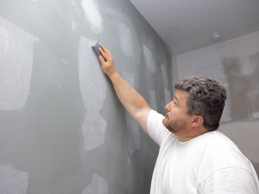
Once everything’s dry, it’s time to sand. Use a sanding block or fine-grit sandpaper, and go over all the patched areas until they’re flush with the wall. Don’t forget to hit any rough spots, too. Smooth walls are the secret sauce to a great paint job.

a man sanding a wall


How Do You Patch and Sand If You Have Textured Walls?

If you’ve got textured walls, you’ll want to blend any patches into the existing texture. A smooth patch on a textured wall sticks out just as much as a dent. You can buy spray-on texture or use a sponge technique to mimic the texture pattern before painting.

Again, if the wall is textured, don’t sand the entire wall after pathing. Just sand the spots where you’ve patched.

If you’re working with a heavily textured wall (like knockdown or popcorn), focus more on cleaning and patch blending than sanding. But don’t skip prep. Texture won’t fix bad repairs!

So take your time and get those walls nice and smooth. Run your hand over the surface when you’re done—it should feel even, not like a gravel road. Your future self will thank you when the paint goes on like butter and looks flawless.

Step 4: Tape of Trim and Edges

You want clean, sharp lines, right? Then painter’s tape is your best friend. I know some people think they’ve got the steadiest hand on the planet, but trust me, even the pros use tape. It’s the difference between a paint job that looks polished and one that looks like a kindergartener did it.

First, invest in quality tape: Don’t grab the cheapest roll you find. Go for a good painter’s tape designed for your surface. Different tapes work better on walls, trim, or glass. One of my go-to multi-surface painter’s tapes is this one: ScotchBlue Sharp Lines Multi-Surface Painter’s Tape

Next, take your time. Lay the tape down carefully and press it firmly along the edges to stop any paint from sneaking underneath. If you don’t press it, paint WILL creep underneath and you’ll end up with those kindergarten lines we’re trying to avoid.

Finally, after you paint, remove it right. Pull the tape off while the paint is still slightly wet for the cleanest lines. If you wait too long, you might end up peeling chunks off your fresh paint job.

Step 5: Prime the Walls

If you think skipping primer will save you time, I’ve got bad news: it won’t. Primer is what makes a great paint job. It helps the paint stick better and stops old colors or stains from bleeding through. Skip this step and you’ll regret it later.

Also, primer can save you money in the long run! Primer is cheap and paint is expensive, so don’t waste expensive paint when you should be priming first. 

Pick the Right Primer

If you’ve got stains, use a stain-blocking primer. For painting over a bold-colored wall, tell the paint store your final color and have them tine the primer towards it. You’ll probably need two coats of primer. And make sure you cover the walls evenly. 

Let the primer dry completely before grabbing your roller. If you rush it, you’ll get patchy results.

One time, I had a homeowner who decided to skip priming their bright red accent wall. They figured beige paint would cover it just fine. Three coats later, the red was still peeking through and they were all out of paint and patience. I came in, slapped on a proper primer, and got it looking good with one coat of beige. Lesson learned: primer saves you time, money, and headaches in the long run.

Step 6: Test the Paint Color

Whatever looks good on a tiny swatch in the store can look completely different once it’s on your wall. Lighting, furniture, the size of your space, and any adjacent colors all change how a color comes across. Testing it out first can save you from a serious case of paint regret.

One way to test a color is to paint a test swatch. Choose a spot on the wall or use a sample board. Look at it in different lighting (morning, afternoon, and night.) Colors can shift dramatically under warm bulbs vs. natural sunlight. Ask yourself how it’ll match your furniture, flooring, and fixtures. 

I had a client who insisted on a deep gray they saw at the store. It looked sleek and modern under the store’s bright lights. But once we painted a test swatch at home, the gray looked almost black under their warm evening lighting. Luckily, we caught it early and swapped to a lighter gray that worked perfectly. 

tools for painting

Step 7: Get the Right Tools

You can’t get the job done right without the right tools. Trust me, the quality of your brushes and rollers makes all the difference between a smooth finish and a streaky mess. Having everything ready beforehand saves time and frustration.

Stock up on all the items you’ll need for the paint job. Here are some of my favorite brands:

Skip the bargain bin for tools. Keep a step ladder handy for those hard-to-reach spots. And have a damp cloth ready to wipe up any drips or mistakes.

Final Thoughts: Prep Your Walls for a Pro-Level Paint Job

Skimping on the prep time might seem like a way to save time, but it’s really the opposite. For a professional-grade paint job, you need to clear the space, clean, patch, tape, prime, test colors, and gather the right tools. Skipping these steps is how painting disasters happen.

Got a painting prep story of your own? Or maybe you’re unsure about something? Drop a comment below. 

The Psychology of Color: How to Choose the Right Paint Shade for Every Room

If you’ve ever seen a wall of 1,000s of swatches, you know how hard it can be to choose the right paint color. Can anyone even really tell the difference between Aegean Teal and Boca Raton Blue? Plus, how can you tell if the color you like will still look good after it’s covering your walls? There’s nothing worse than spending hundreds of dollars and several back-breaking hours rolling paint on your walls, only to find that you don’t even like it afterwards. 

Color psychology can help you narrow down your paint choices! 

Choosing a color for any room in your house goes beyond personal preference. Color can affect your emotions and even behavior. It can make you feel calm, energetic, or agitated. In this guide, I’ll show you how to use color psychology to create a space that perfectly suits the purpose of the room—and how you want to feel when you’re in it.

Table of Contents

  1. Introduction: Why Color Psychology Matters
  2. What is Color Psychology?
  3. The Psychology Behind Each Color
    • Red: Energy and Passion
    • Orange: Creativity and Excitement
    • Yellow: Optimism and Energy
    • Pink: Tenderness and Love
    • Green: Balance and Freshness
    • Blue: Calm and Focused
    • Purple: Luxury and Imagination
    • White: Clean and Spacious
    • Gray: Neutral and Modern
    • Black: Bold and Elegant
  4. Room-by-Room Paint Color Psychology Guide
    • Living Room: Create a Welcoming Atmosphere
    • Bedroom: Promote Rest and Serenity
    • Kitchen: Bright, Fresh, and Active
    • Home Office: Boost Focus and Productivity
    • Bathroom: Refresh and Relax
    • Dining Room: Encourage Conversation and Appetite
  5. Tips for Selecting the Right Paint Shade
  6. Common Color Mistakes to Avoid
  7. Conclusion: Choosing Colors with Confidence

What is Color Psychology?

There’s a reason why bedrooms tend to use muted colors, while supermarkets tend to blast you with bright colors like red. Softer colors can make you feel relaxed, while vibrant shades can boost your energy or even make you feel agitated. We humans respond to each color in different ways. While color psychology is still an emerging science, there’s some evidence that color can help lower stress, improve sleep, and more. 

There are all kinds of different paint color categories, but the first and most basic one you need to understand is “warm” vs. “cool” tones. Think of your old friend ROY G. BIV—the colors of the rainbow. Red, orange, and yellow make up the warmer tones, while green, blue, and purple are considered cool. (Yes, you can find cool versions of warm colors, like a blue-ish red, but that’s a blog post for another day!) 

Warm tones are like fire—they bring to mind passion, energy, and warmth. Cool colors are the opposite. They can inspire relaxation and focus. Ever been to a spa or therapist’s office? They usually use cool colored paint to make clients feel relaxed and comfortable.

The Psychology Behind Each Color

Every color has its own psychology that evokes emotions and affects how we feel and behave. The effect of a color on you may be different depending on your cultural background, personal association, even your belief in the color’s effect.

Here’s a breakdown of what each colour can communicate, how it can affect your body, and how you can use them in your home.

Red: Energy and Passion

Red is a strong, stimulating color that can bring up strong emotions like excitement, passion or urgency. It can make you breathe faster, speed up your reactions and heart rate, and even raise your blood pressure!1

Red paint is great for areas where you want to energize, like dining rooms or home gyms. In fact, red is the most common color used in the food industry! But too much red can be overwhelming. Use it sparingly or as an accent.

Orange: Creativity, Youth, and Excitement

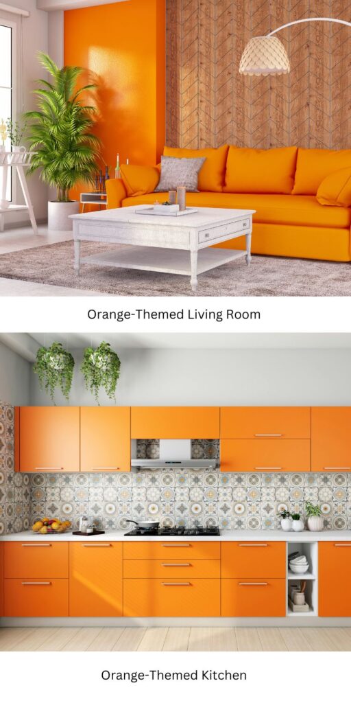
Orange combines the energy of red with the optimism of yellow. It’s uplifting and creative. It can also make you feel competitive and even physically stronger! It’s great for workout rooms, art spaces, or playrooms. But it’s probably too bold for spaces where you want to chill. 

Also keep in mind that it’s the color most often chosen as people’s least favorite color, so you may not want to paint your hosting spaces orange.

Look at this photo of the orange accent wall in the living room. Is this the kind of space that would make you feel relaxed? For most people, the answer is no. (But if that’s your style, go for it!) The orange feels more appropriate to me in the photo of the kitchen, where you’d want to feel lively.

Yellow: Optimism and Energy

Yellow is warm and happy, and it often brings up feelings of sunshine and positivity. It can also raise blood pressure and make your heart beat faster, but not to the same extent as red. Yellow paint is great for kitchens or playrooms, but be careful. Too much bright yellow paint can be overstimulating or even frustrating for some people. 

Pink: Tenderness and Love

People often think of pink as loving, kind, and nurturing. It can even reduce signs of physical aggression. A Navy detention city in Seattle found that angry prisoners became calm after only 15 minutes in a pink cell. After noticing this, jails began using pink to calm down aggressive prisoners!3

Softer shades of pink create a calming atmosphere that can be good for bedrooms or nurseries. Brighter pinks like “hot pink” or fuschia can add energy and playfulness to a room. That can work really well for creative spaces or accent walls.

Green: Balance and Freshness

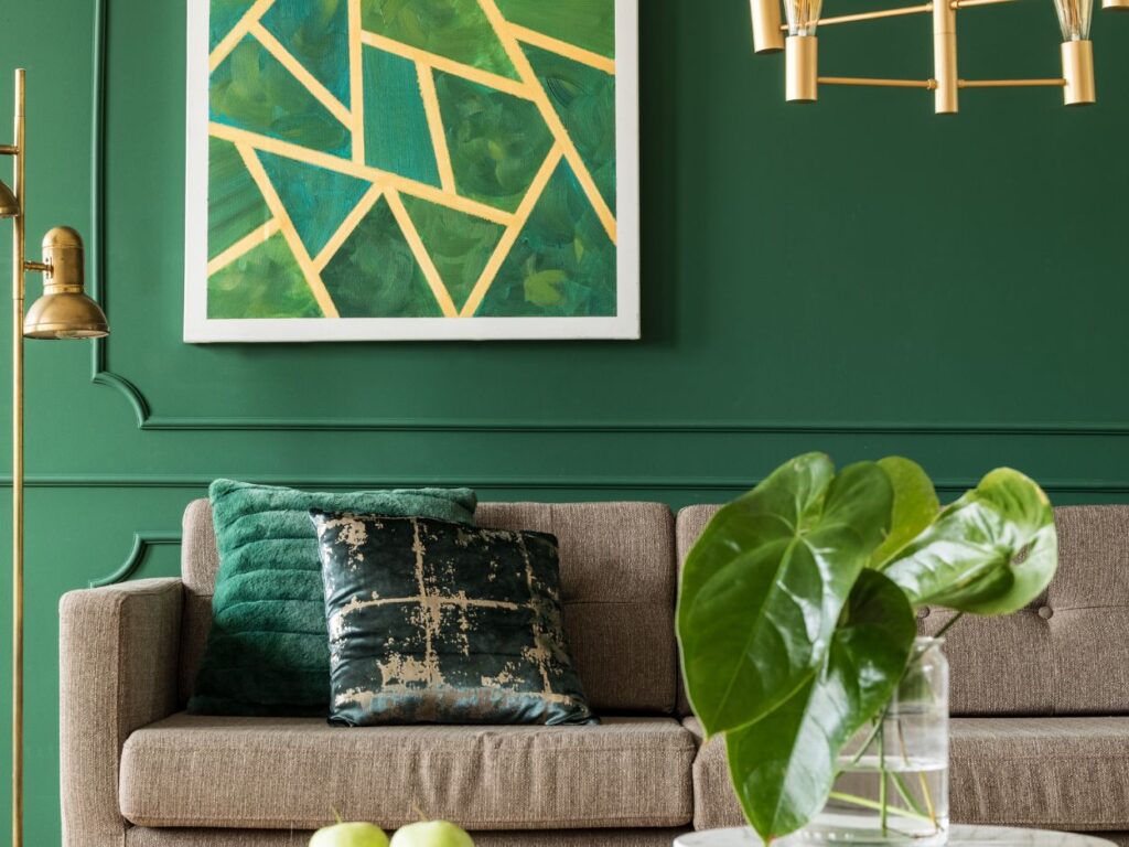
Green makes us think of nature, harmony, and renewal. It can boost your mood when you’re feeling down and slow down your heart rate.4 Green can also symbolize independence and inspire you to make changes. 

Green’s versatility makes it a great choice for any room, from living spaces to home offices. Softer greens are calming, while brighter greens are energizing. Be careful: shades of green paint that are closer to yellow can be agitating for some people.

Blue: Calm and Focused

Blue is most popular favorite color in the world! It’s the go-to “education” color because of its association with wisdom. It calls to mind serenity, trust, and focus. Lighter shades create a calming space, perfect for bedrooms or bathrooms. Darker blues can make you ready to concentrate, which is why they work well in offices or libraries. A word of warning: too much exposure to darker shades of blue can make you feel, well, kind of blue.5 

Purple: Luxury and Imagination

Purple has been associated with royalty, sophistication, and creativity in many cultures for centuries. It was adopted by the women’s suffrage movement and is often used to reward bravery, as in a “Purple Heart.” Light lavender tones are calming, perfect for bedrooms, while deep purples add drama and glamor to living rooms or dining areas.

White: Clean and Spacious

White is a classic choice for a clean, open feel. It’s strongly linked to innocence and new beginnings, and it can enhance focus and memory in working spaces.6 It’s clear and simple, great for kitchens, bathrooms, and small spaces that you want to feel bigger. You can easily pair white with pops of color to add personality. Too much bright white can feel harsh, though—think “hospital room” vibes.

Gray: Neutral, Modern, and Mature

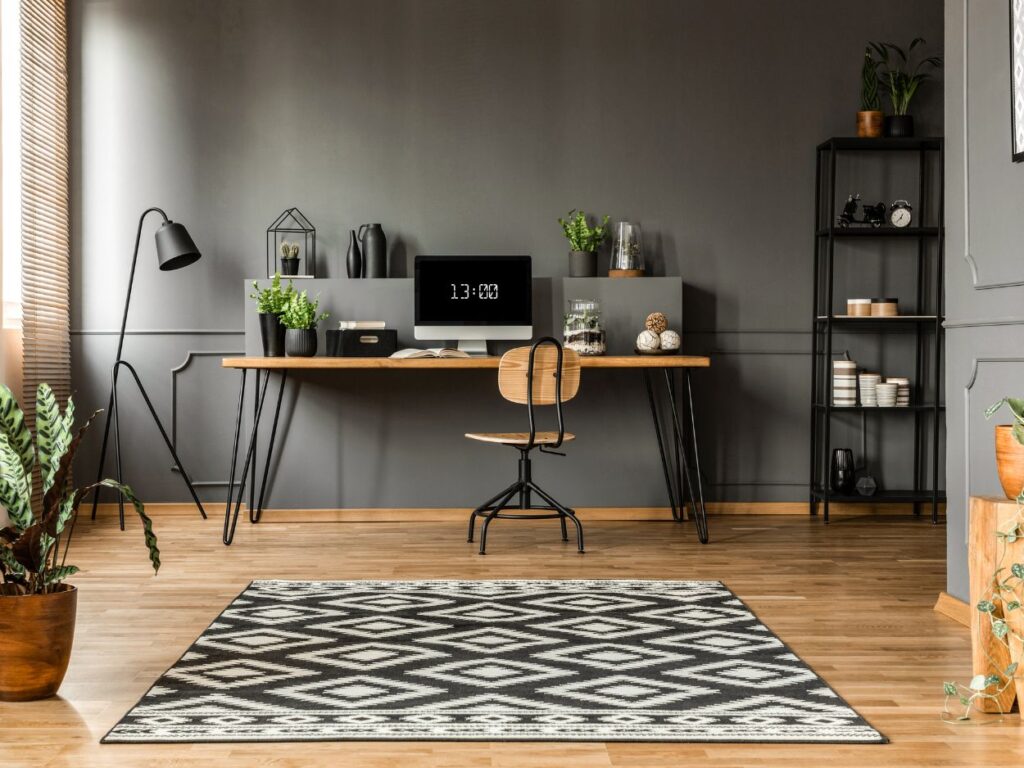
Gray is a neutral that can feel warm or cool depending on its “undertones,” or its underlying colors. It can be hard to see the undertones of a single color, but if you hold it up next to another color or shade of the same color, it can become more apparent. While gray can feel bland and “cookie cutter,” it can also be sophisticated and balanced. Darker shades of gray paint can feel moody and dramatic, while lighter shades can feel more easygoing. It’s great for living rooms, offices, and modern spaces.

Black: Elegant, Bold, and Sometimes Negative

While many people associate black with sadness or aggression, it can adds depth, drama, and a sense of luxury when used sparingly. Most people find that it’s too heavy for full walls in most cases, although you’d probably disagree with me if you are a gritty gym or a tattoo shop! In homes, it works beautifully as an accent color or for furniture and trim.

There are plenty more ways I could categorize colors for you, but I know you’re interested in how paint colors affect your living space. So I’ll cut to the chase by giving color psychology tips that can help you choose a paint color for each room in your house below.

Room-by-Room Paint Color Psychology Guide

When thinking about which paint color to choose for any room in your house, keep in mind the following question: How do I want to feel when I’m in here? Considering whether you want to feel relaxed or energized can help you rule out tons of colors by process of elimination.

Living Room: Create a Welcoming Atmosphere

The living room is the “heart” of your home. It’s for relaxing, family time, and entertaining guests. Neutral tones like beige, taupe, and light gray can help create a cozy backdrop for all kinds of activities. These colors pair well with many different styles of furniture and decor, so you can easily refresh the look of your space without needing to repaint. For an even more inviting touch, use soft greens or warm earth tones. These can bring to mind feelings of nature and comfort.

I remember one of my past clients wanted a color that felt inviting for their frequent movie nights and book club gatherings. We chose a warm beige paint color. Afterwards, the space felt calm and adaptable. The family shared how everyone complimented the soothing vibe of their living room.

Bedroom: Promote Rest and Serenity

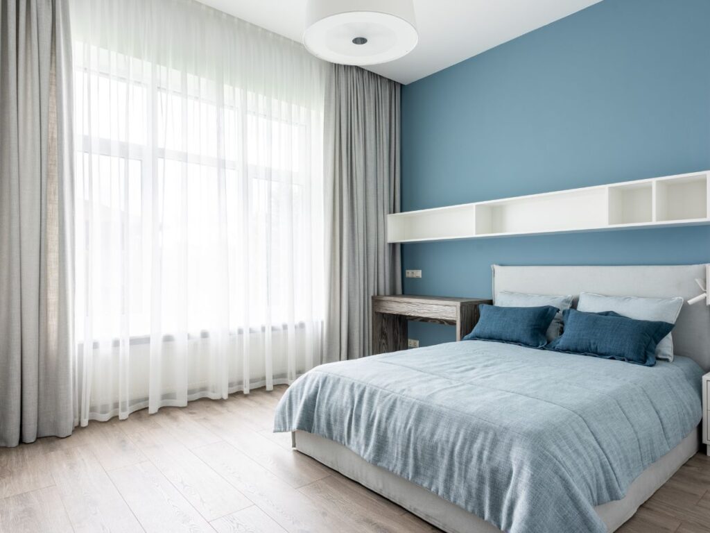
Your bedroom is your sanctuary, and the right colors can help you wind down and sleep better. Calming tones like pastel blues, soft lavender, and muted greens are great for promoting relaxation and reducing stress. Cool tones can lower your heart rate and encourage a peaceful atmosphere. To create a truly restful space, avoid bold or overly bright colors, which can be stimulating.

For bedrooms, I almost always recommend blue. It may not be the most scientific reason, but everyone I know that has a blue bedroom swears it helps them sleep better.

And actually, a study of 2,000 homes found that people who sleep in blue rooms get more sleep than in other colored rooms!7 

Kitchen: Bright, Fresh, and Active

If you’re anything like me, the kitchen is where you make core memories with your family. You want it to be a place that feels energized, stimulating, and fresh. While you might want other areas of your house to be more subdued, the kitchen is where you can get a little bold with your paint color choices, if that’s your thing. 

Bright yellow paints are a good choice for a kitchen, since they can stimulate appetite (and maybe even make you feel motivated to cook after a long day of work!). For a softer vibe, creamy whites and sage greens can feel fresh, clean, and “culinary.”

On one of my favorite kitchen projects I worked on for a client, we painted the walls a vibrant yellow and the cabinets a crisp white. It felt inviting and modern at the same time.

Home Office: Boost Focus and Productivity

A home office should make you feel concentrated and creative, not distracted. If you work in a creative field like design, you might choose bold colors to feel inspired. But for most people, this is going to mean soft blues, muted greens, and neutral grays. Blue can make you feel more productive and less stressed while green can adds a sense of balance. I would avoid warm tones, which can feel distracting in a workspace.

One of my clients was a freelance graphic designer who spent hours each day in his home office. He wanted it to feel professional but not sterile. We painted his office in a muted gray-green. The color brought a calming vibe to the space. He told me it helped him stay on task and inspired during his workdays.

Bathroom: Refresh and Relax

The bathroom is where you get your day started and do your evening routine. Most people want a bathroom that makes them feel calm and refreshed. Pale blues, aqua tones, light grays, and crisp whites are all great for turning your bathroom into your personal spa retreat. These cool tones reflect light and make the small space feel bigger. If you want a modern look, you can pairlight walls with darker tile or trim for contrast.

Dining Room: Encourage Conversation and Appetite

The dining room is a stage for lively conversation and connecting with others. Paint colors like deep reds, warm oranges, and neutral tans work well here. As I mentioned earlier, red is known for stimulating appetite and energy. Warm neutrals make a room feel sophisticated but don’t overpower it. If you want a bold look, you can do a bright orange or deep red accent wall.

Tips for Selecting the Right Paint Shade

Test Swatches

Tape samples on the wall to see how they look in different lighting throughout the day. Do this one sample at a time. Don’t pin multiple swatches next to each other unless you plan to use them together, because colors can take on a different look when compared to other colors next to them.

Consider Your Lighting 

A lot of people overlook this, but a color can look completely different depending on the lighting. A shade that looks perfect in the store or on a swatch might look entirely different under the warm glow of your living room lamps or the natural light of your kitchen window. 

Take into consideration the natural lighting of the room if there are windows, or the light from whatever fixtures you have in there. A darker shade might look great in your mind’s eye, but you wouldn’t want to use it in a space with harsh LED lights.

Consider Undertones 

A seemingly neutral color can have warm or cool undertones that affect the overall mood. If you’re having trouble seeing the undertones, hold the swatch up next to different objects and see if it “matches” them.

Think About Your Furniture 

Make sure the wall color complements the decor you already have or that you want to get

Start Small

Experiment with bold colors in smaller spaces like a bathroom or an accent wall before committing to larger areas.

Common Color Mistakes to Avoid

Choosing the perfect paint color for your space can be exciting, but there are a few pitfalls to steer clear of to ensure your final result is exactly what you envision:

Don’t Overwhelm Small Spaces with Dark Colors

Deep or dramatic hues can be elegant, but they can also make small rooms feel cramped and closed in. For smaller spaces, I recommend lighter tones to help reflect the natural light and create a more open feel. Use the darker shades on accent walls or larger rooms where they can pop                                                                           without overpowering.

Don’t Fall for Trendy Colors That Don’t Match Your Style

Trends come and go. Every time I went into my grandma’s living room with pink carpet and floral couches, I used to think, “This just looks so…old.” But all of that was in style at one time. Always choose the harmony of your space over the latest fad.

Don’t Ignore How Lighting Affects the Final Look

Lighting affects how colors appear in your home. Test your chosen colors in the room’s actual lighting before committing to ensure they work as intended. If you absolutely love a paint color but it doesn’t jive with your lighting, it might be time to install new lighting fixtures!

Final Thoughts on Color Psychology for Paint Selection

Choosing the perfect paint colors is easier than you think. When you understand color psychology and how it impacts emotions, you can design a home that suits you. The right colors can really go a long way—I’d say most of the way—for creating a welcoming, energizing, or calming environment. 

Remember to test swatches, consider lighting and undertones, and make sure your paint complements your existing furniture. Avoid common mistakes like overwhelming small spaces with dark colors or chasing trends that don’t fit your style. Hopefully now you’re ready to choose your paint with confidence and turn your home into a sanctuary!

  1. Color red increases the speed and strength of reactions
  2. Colors Influence Mood
  3. What Does the Color Pink Do to You?
  4. Adaptive Effects of Seeing Green Environment on Psychophysiological Parameters When Walking or Running
  5. The Power Of Color Therapy: Understanding The Basics
  6. Interior Color and Psychological Functioning in a University Residence Hall
  7. The secret to a good night’s slumber is to sleep in a blue bedroom